Our design team has extensive experience in creating case studies that cater to a diverse range of clients across multiple industries and specialties. We employ a multi-faceted approach that integrates traditional and innovative design techniques to craft compelling solutions that meet the specific needs of our clients. Our aim is to provide impactful and visually appealing case studies that effectively communicate our clients' narratives and achievements, while highlighting the value they bring to their respective fields. By leveraging our design expertise, we help our clients achieve their objectives, build their brand, and engage their target audience.
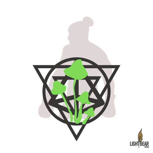
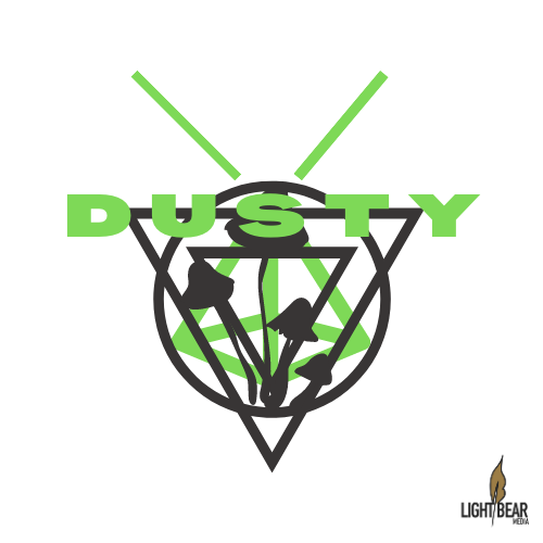
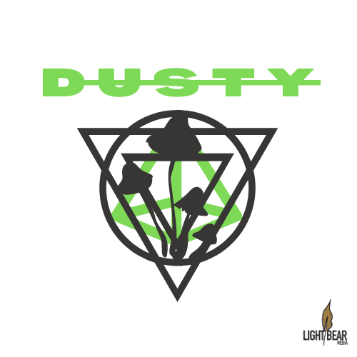
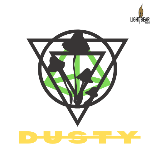
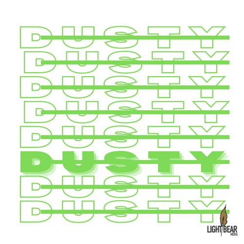
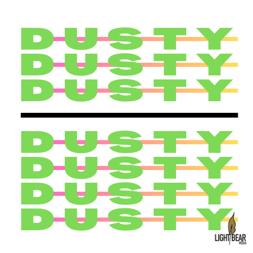
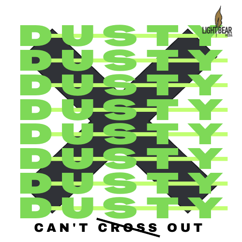
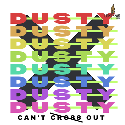
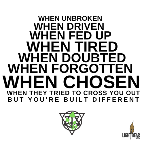
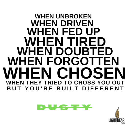
Below are examples, Click to enlarge.
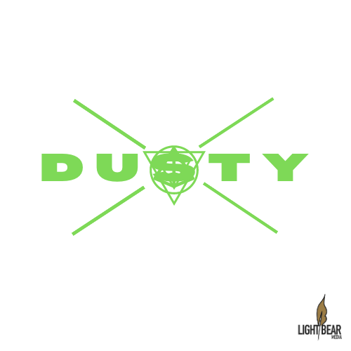
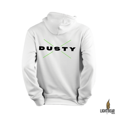
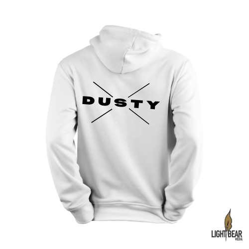
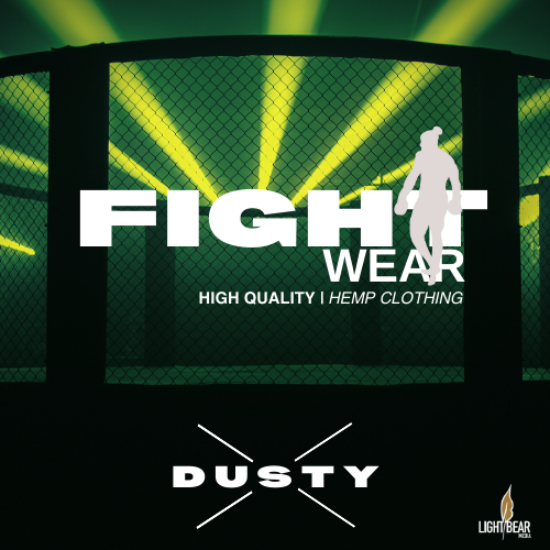
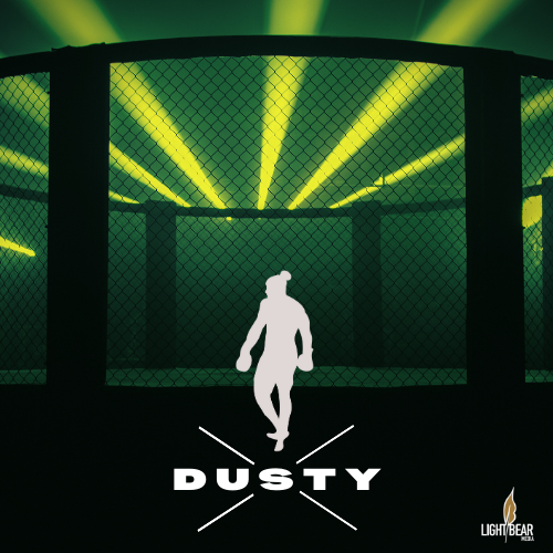
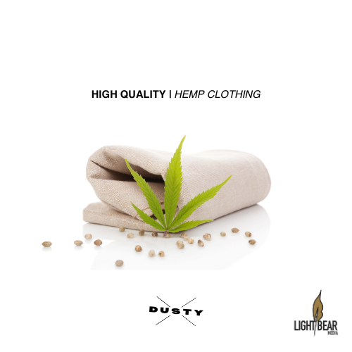
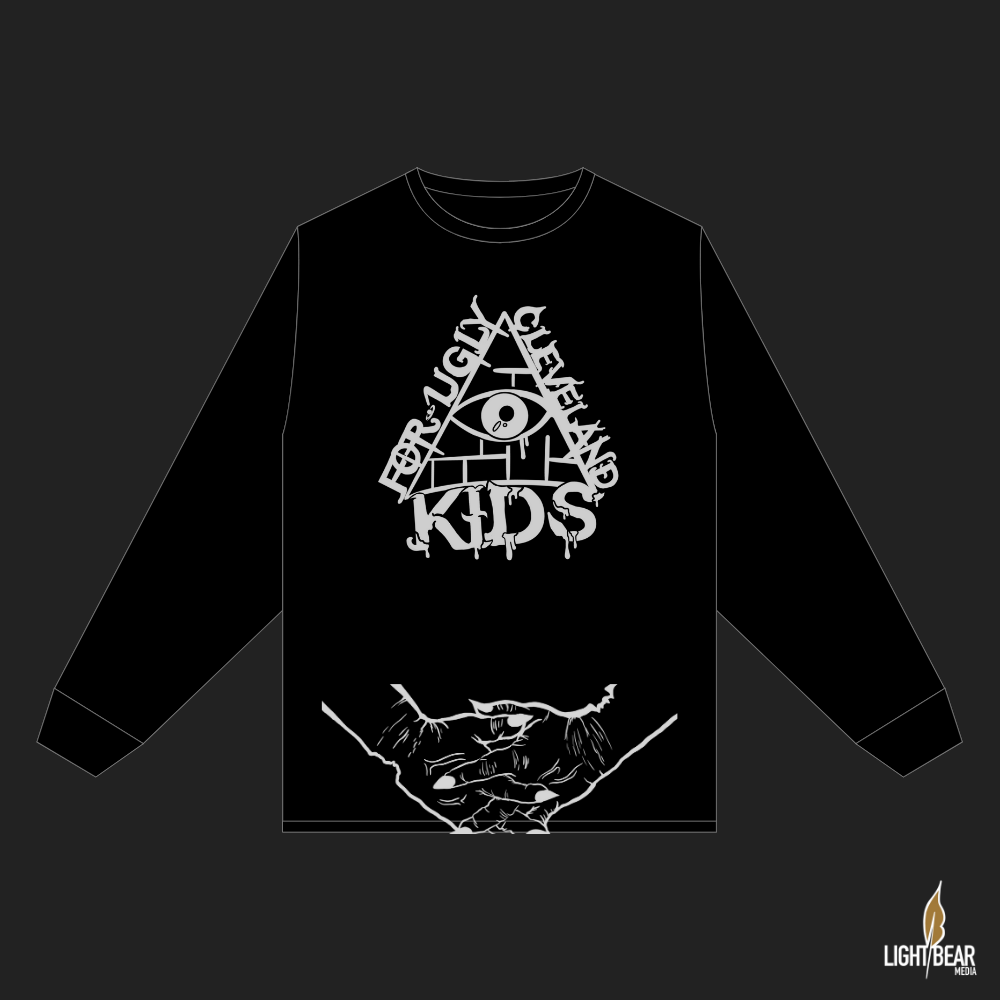
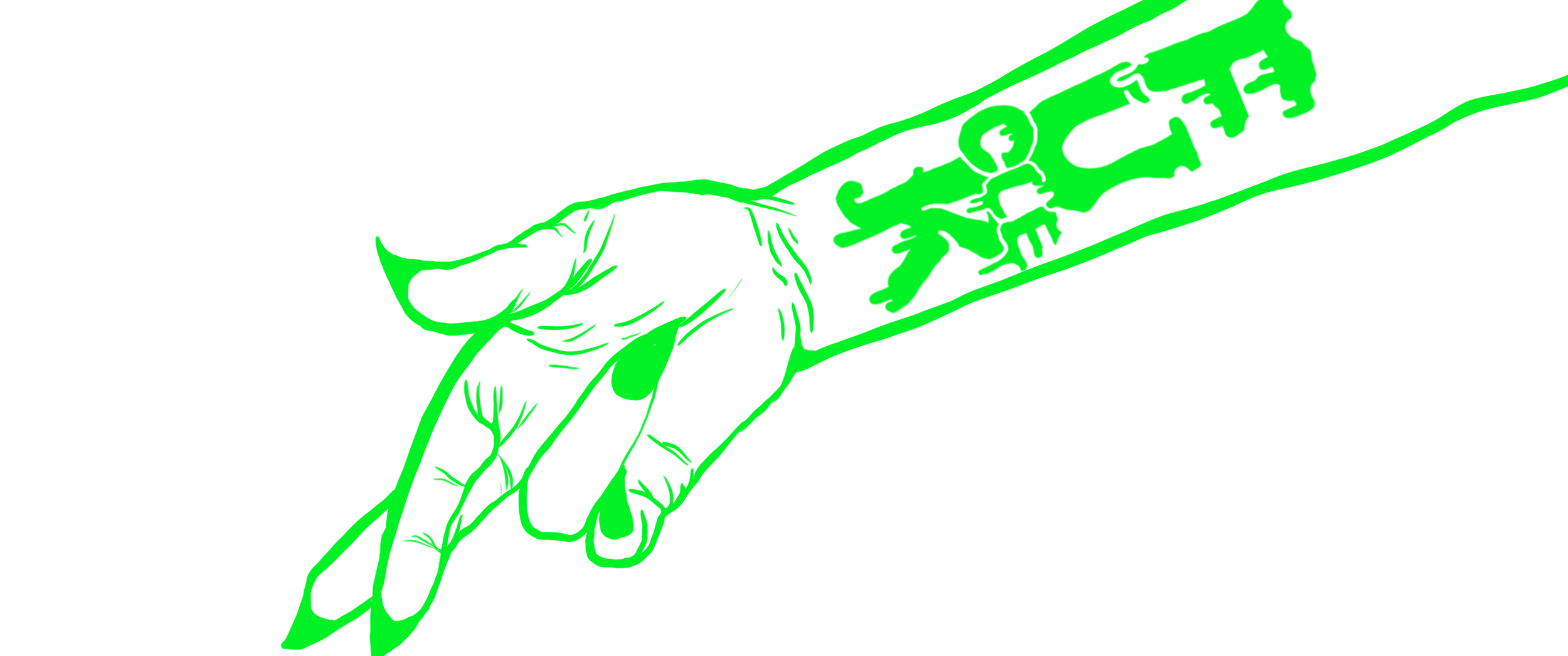
High Quality | Hemp Clothing

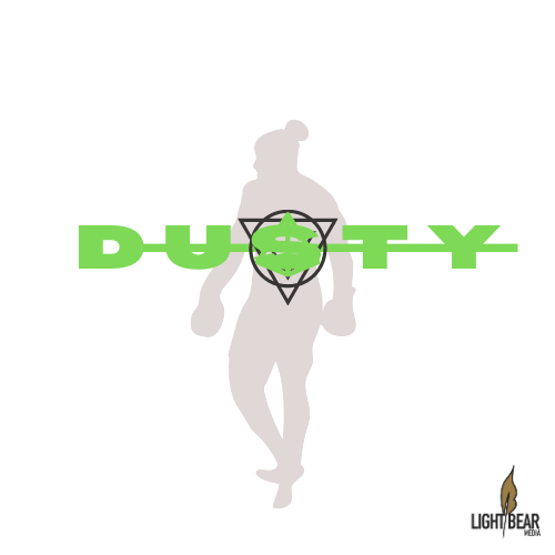


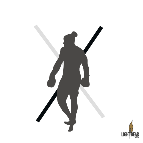

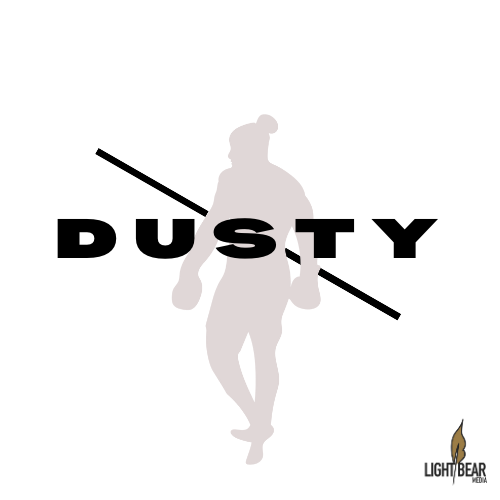
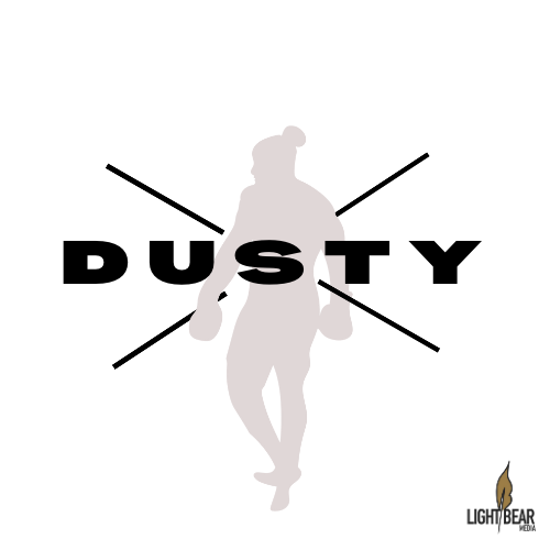


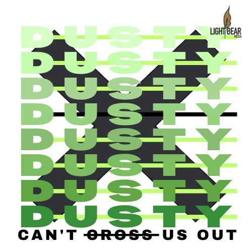
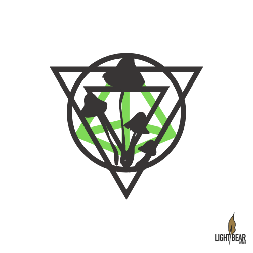

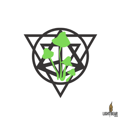

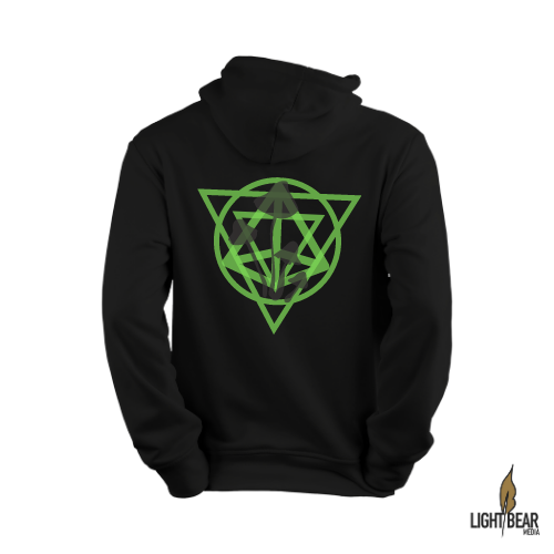


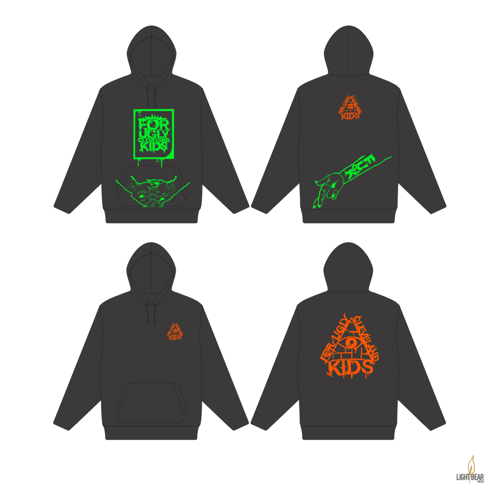
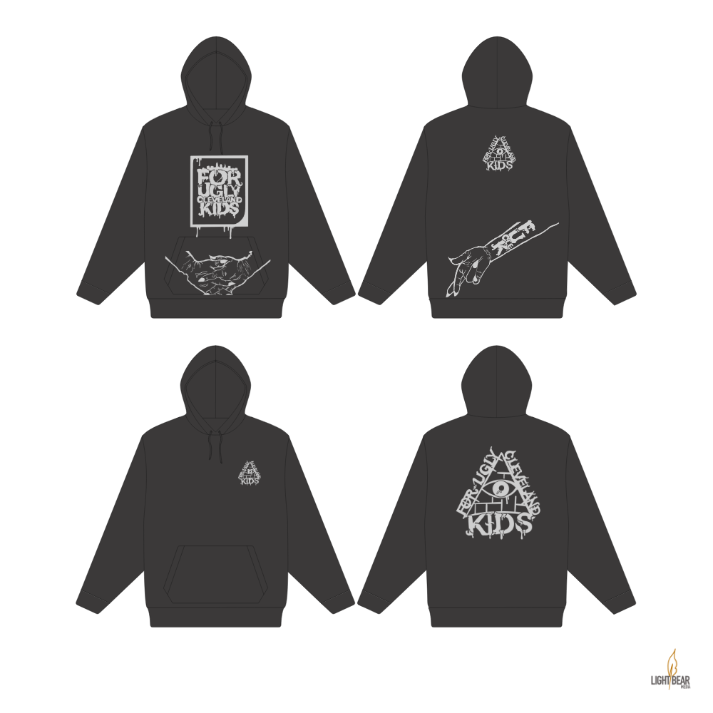
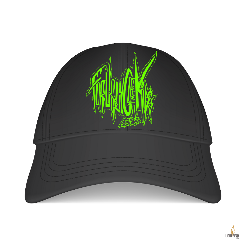
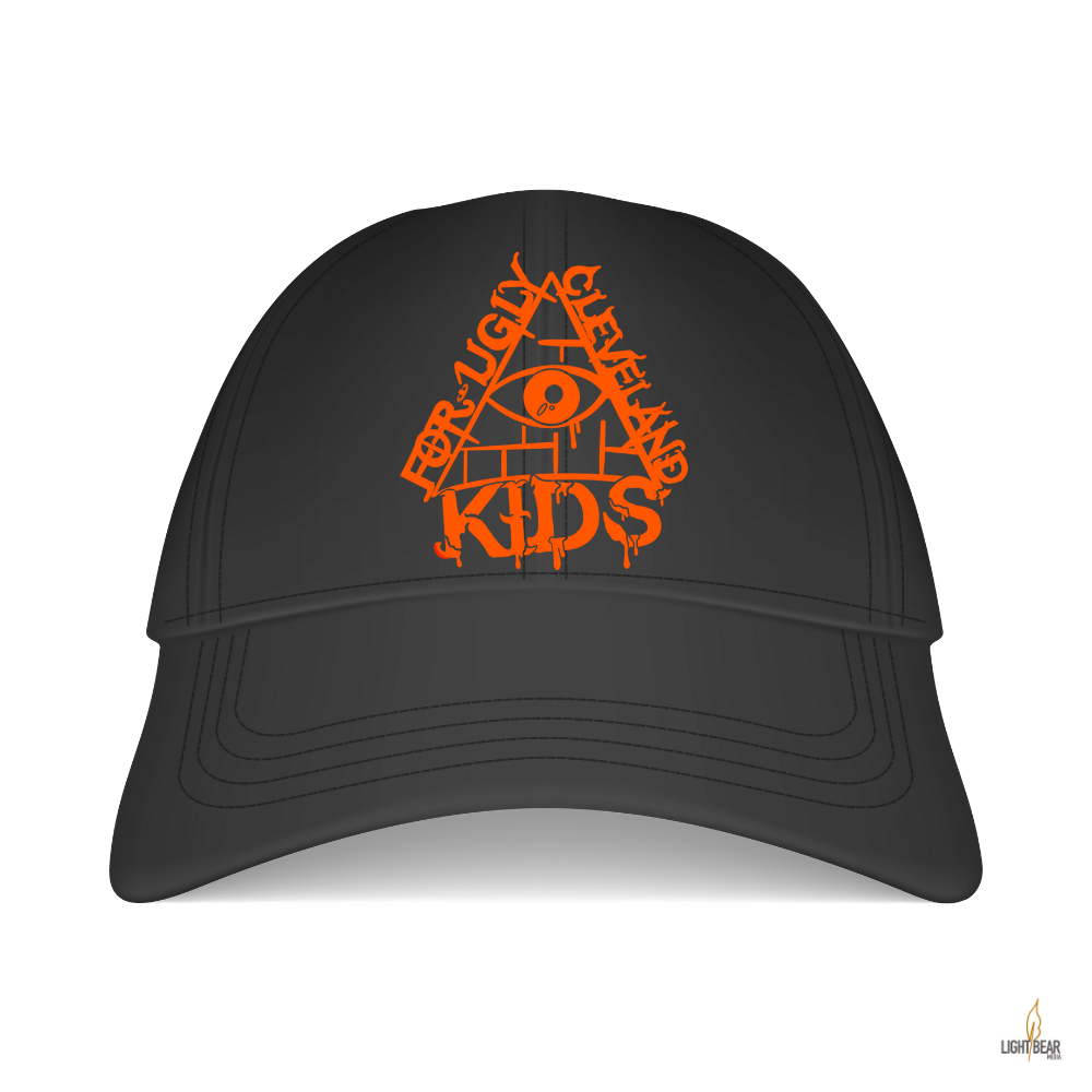
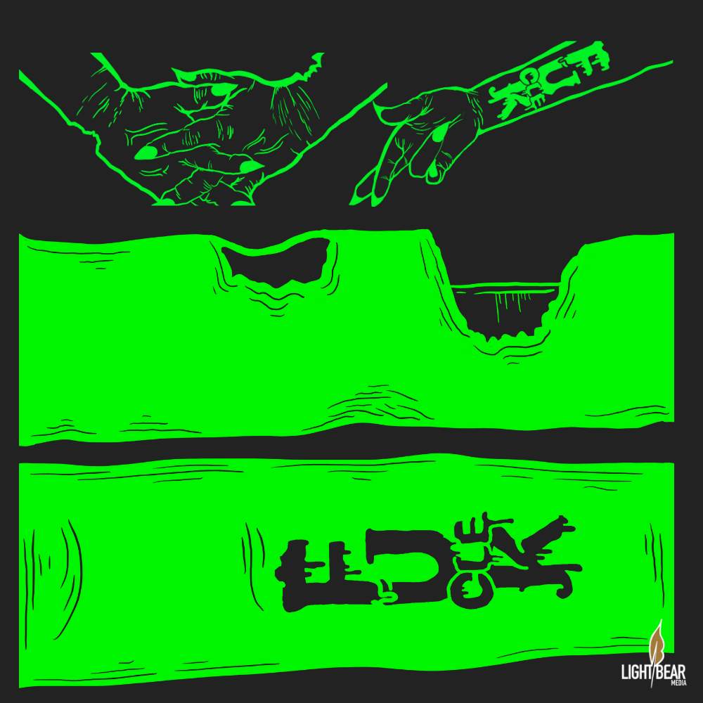
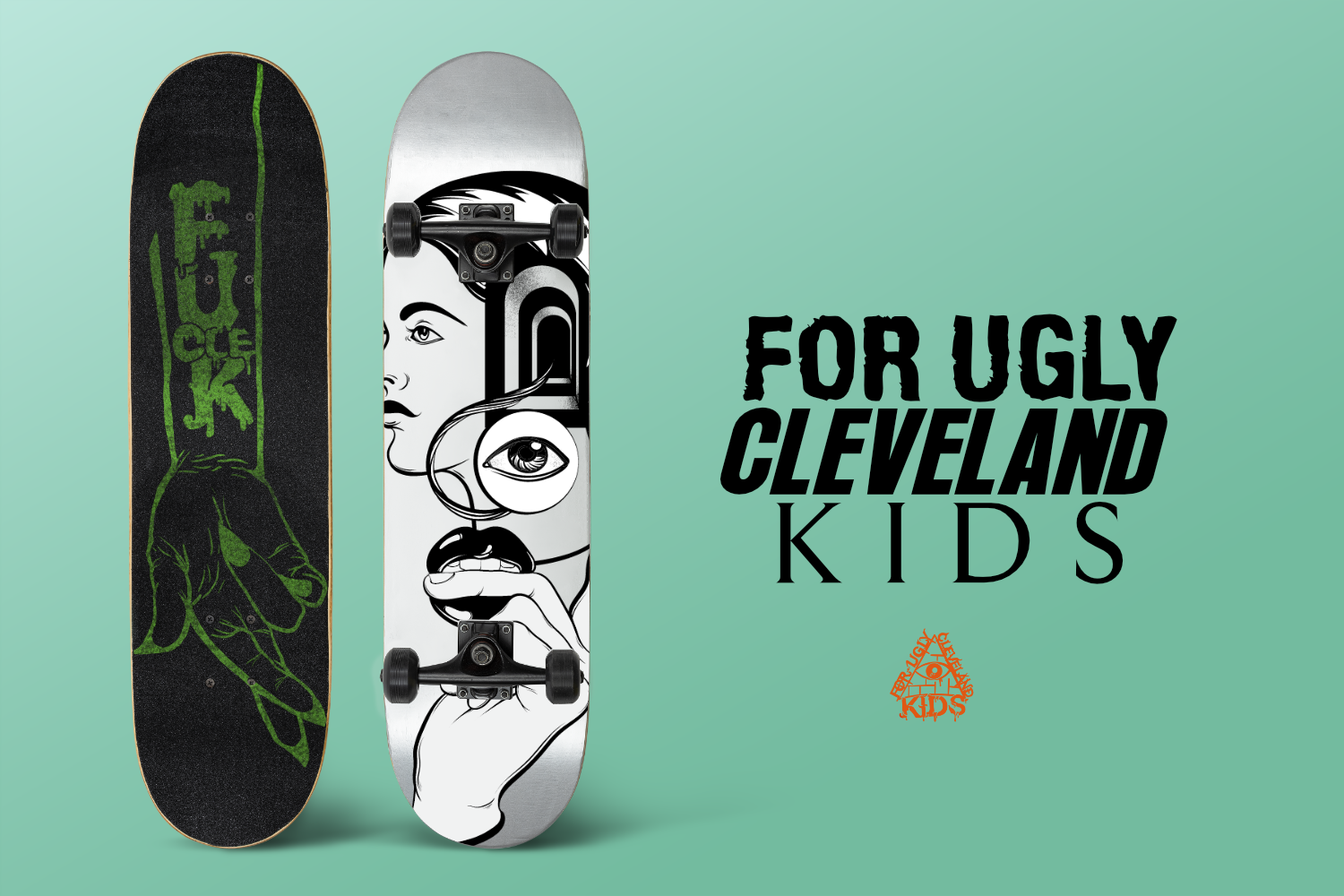
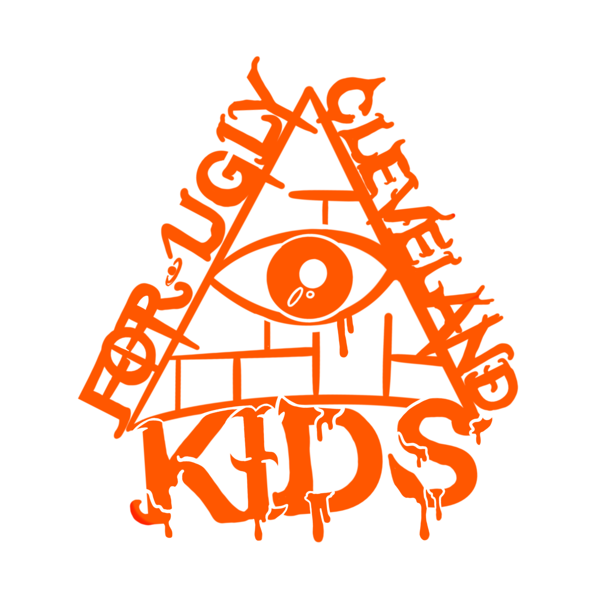
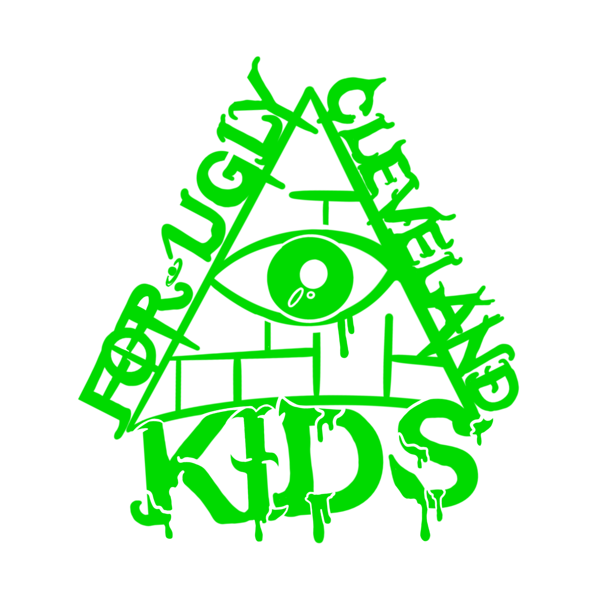
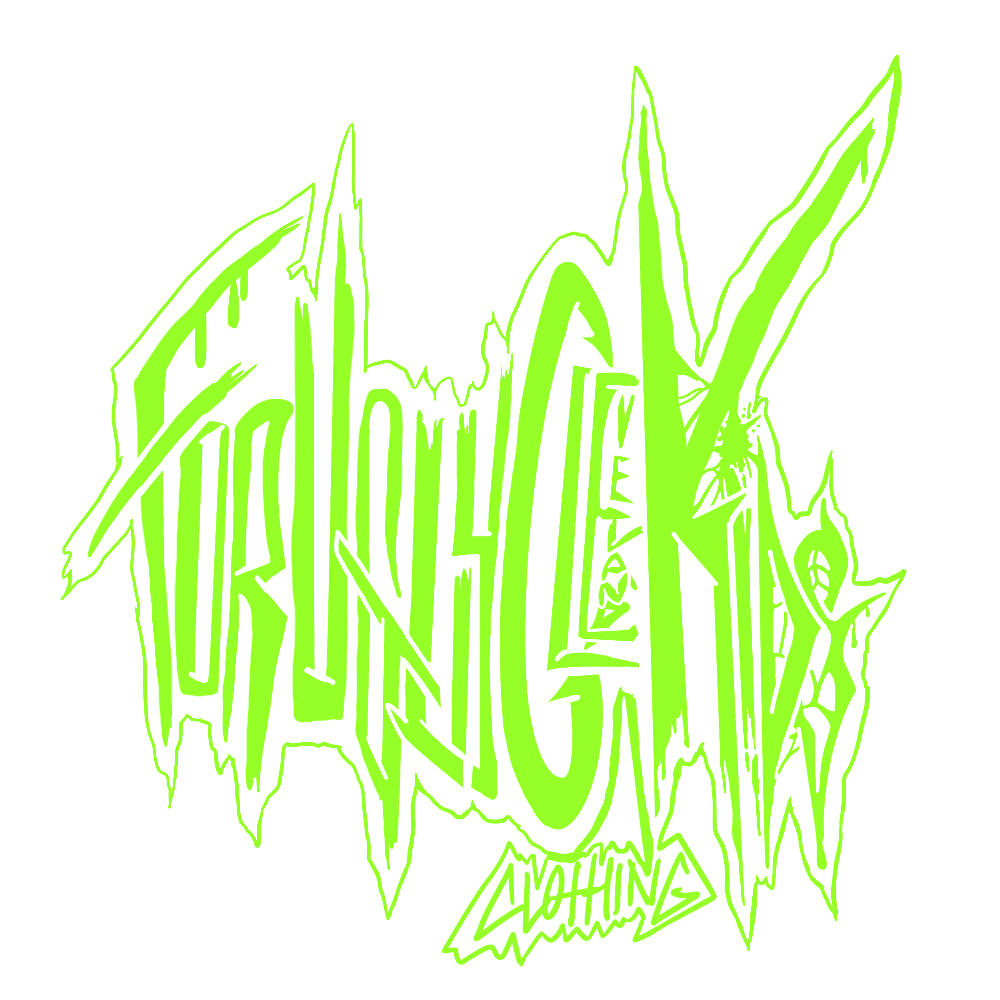
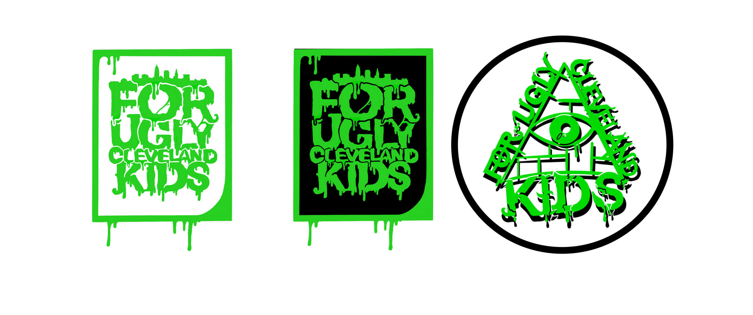
For Ugly Cleveland Kids
For Ugly Cleveland Kids
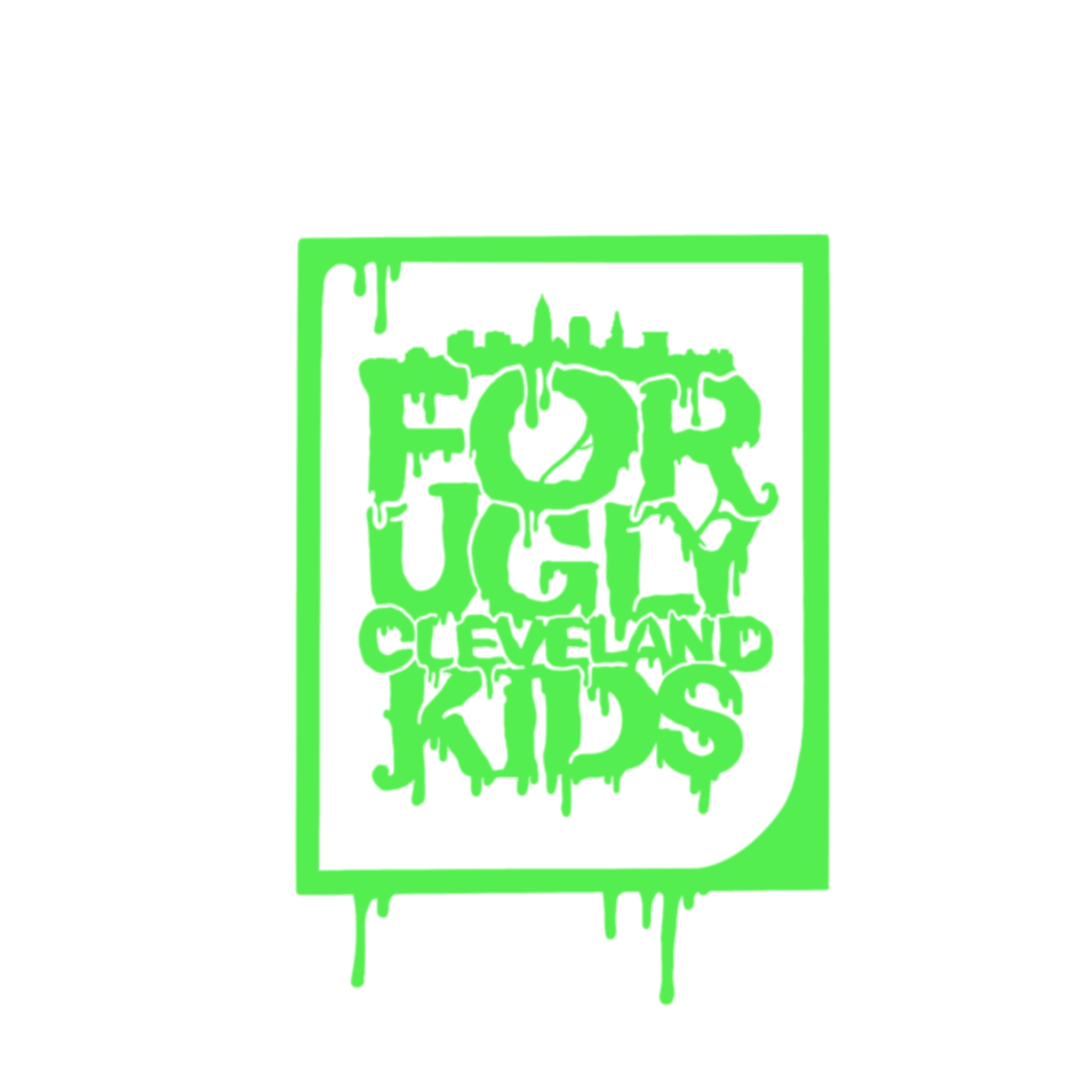
FOR UGLY CLEVELAND KIDS.
FOR UGLY CLEVELAND KIDS IS THE BRAINCHILD OF DAVID YAMNITSKY AND DESIGNED AND PRESSED BY LIGHTBEARMEDIA.COM
SPECIALIZING IN HOODIES AND HATS FOR CLEVELAND GUYS AND GALS TO EXPRESS THE FREAK INSIDE AND SUPPORT THE CITY THEY LOVE.


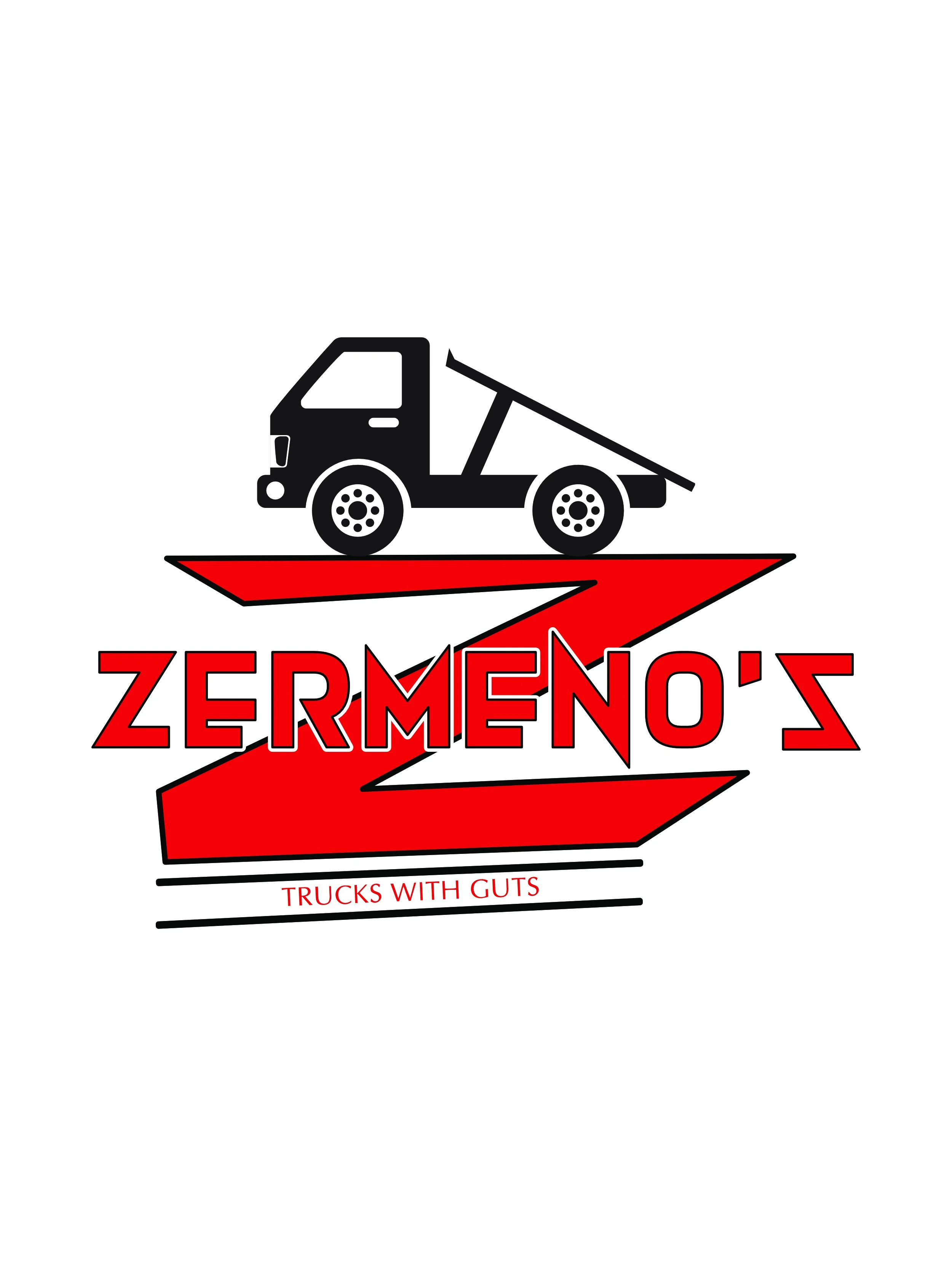
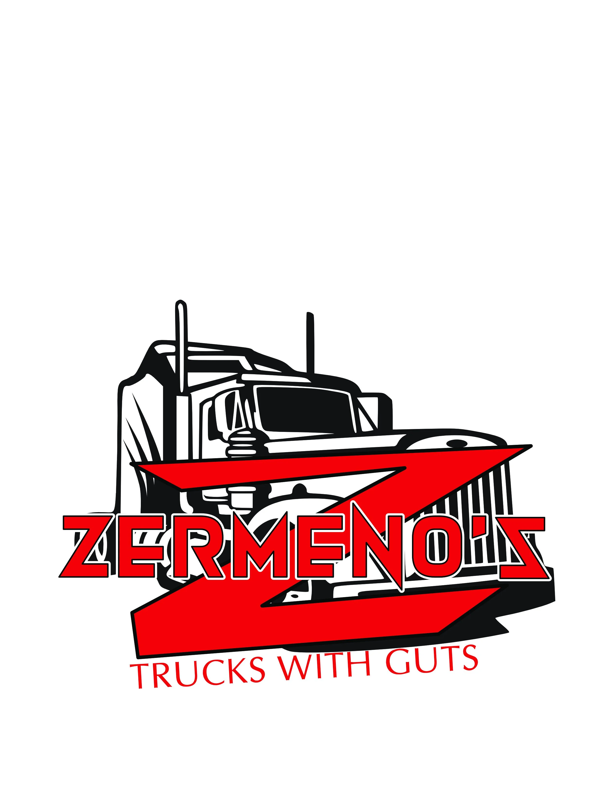
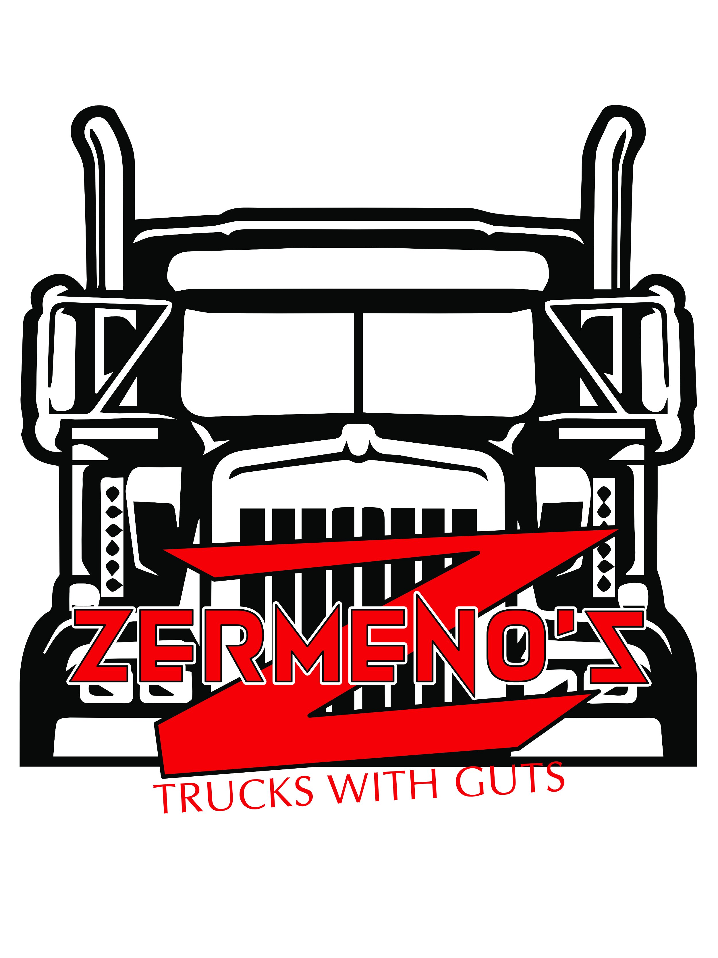
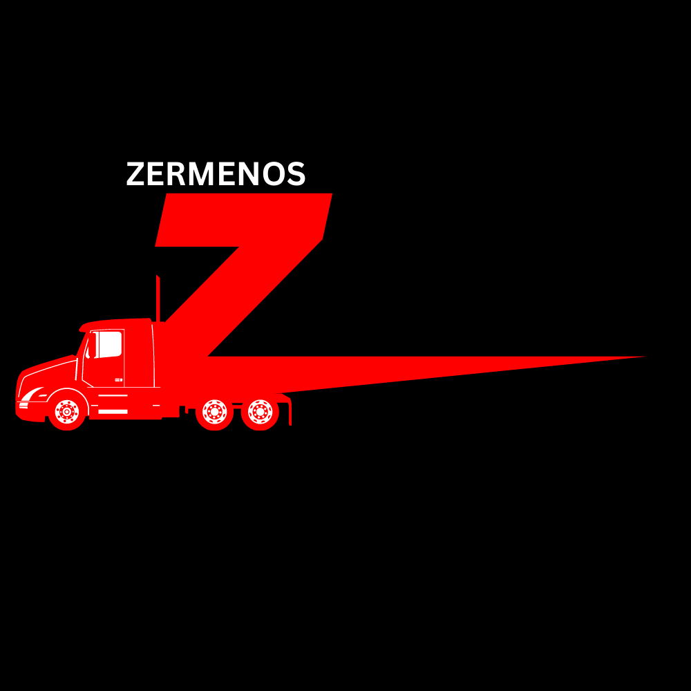
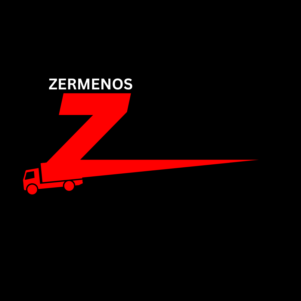
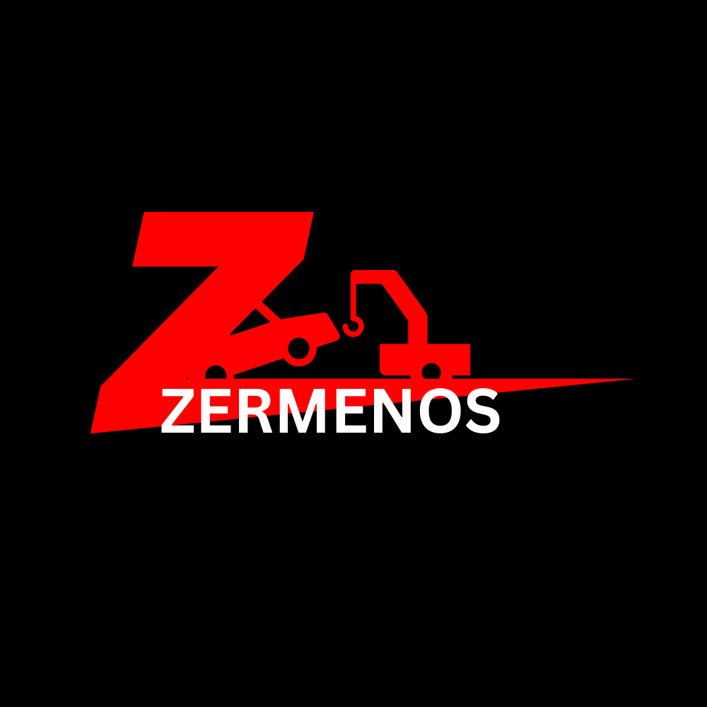
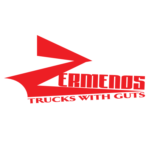
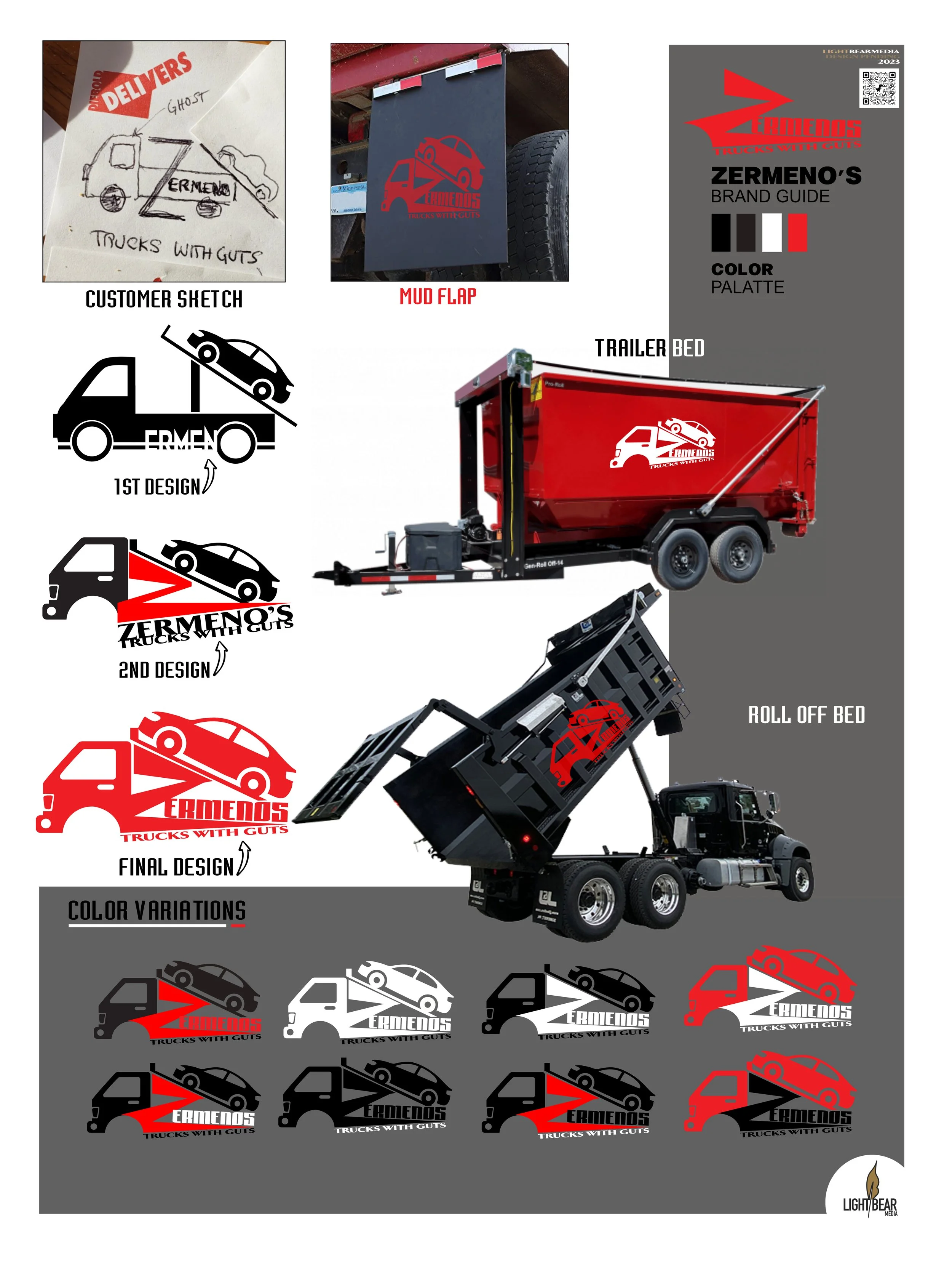
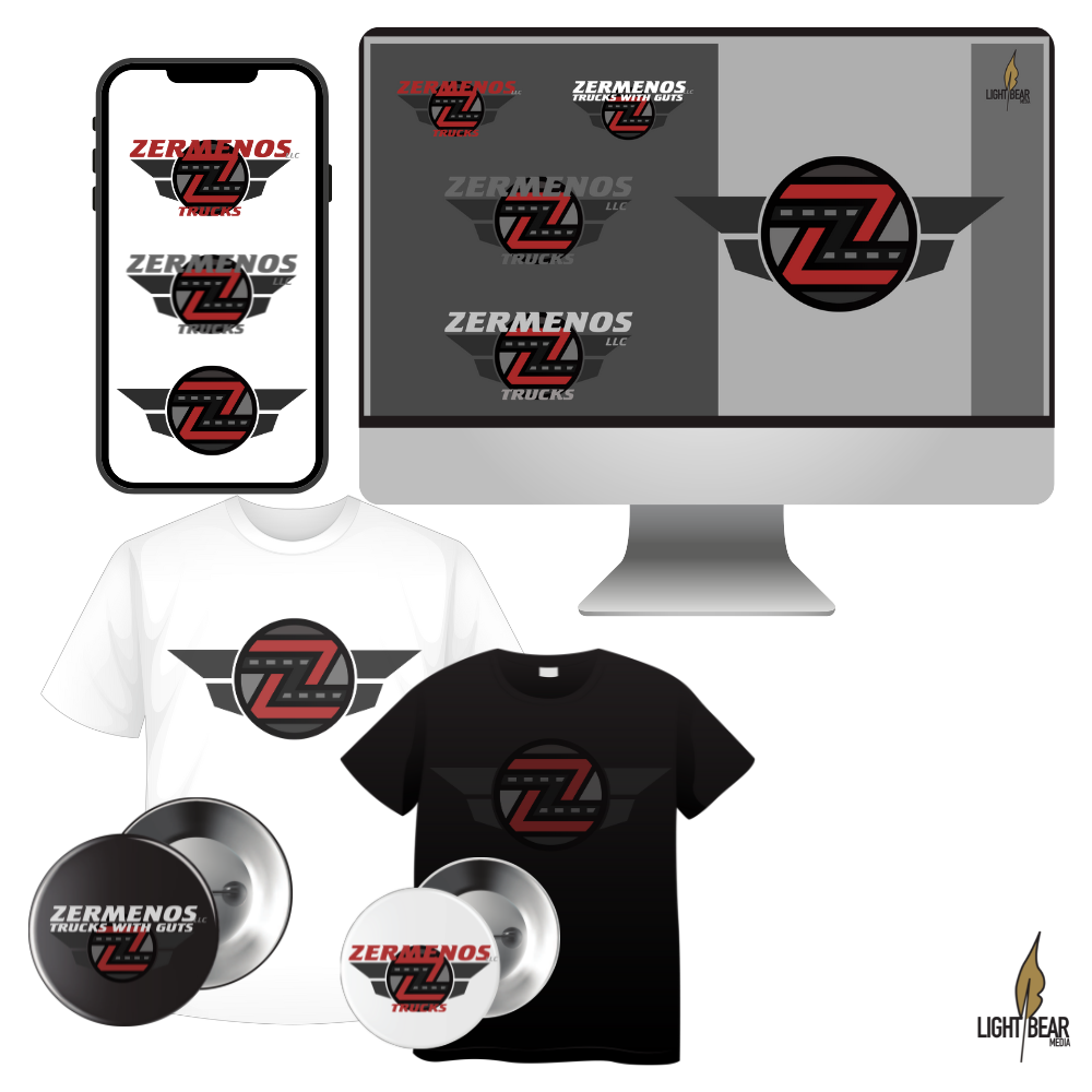
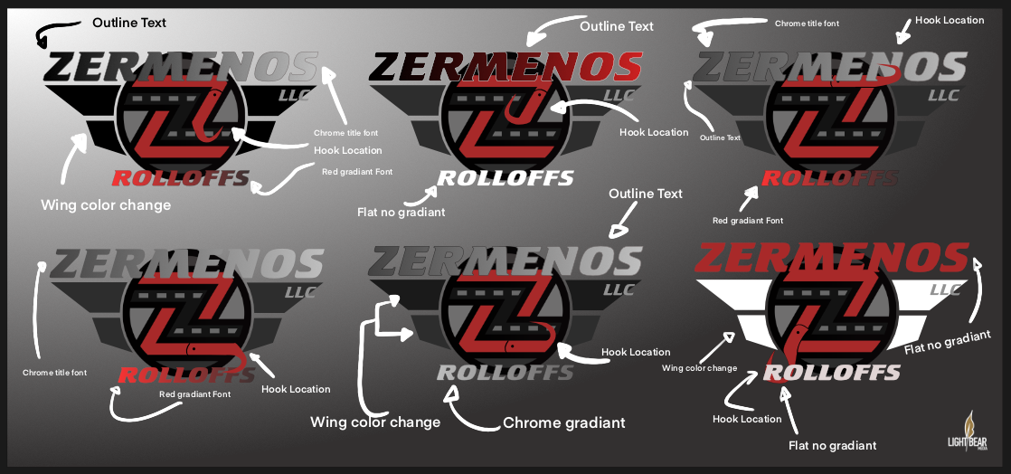
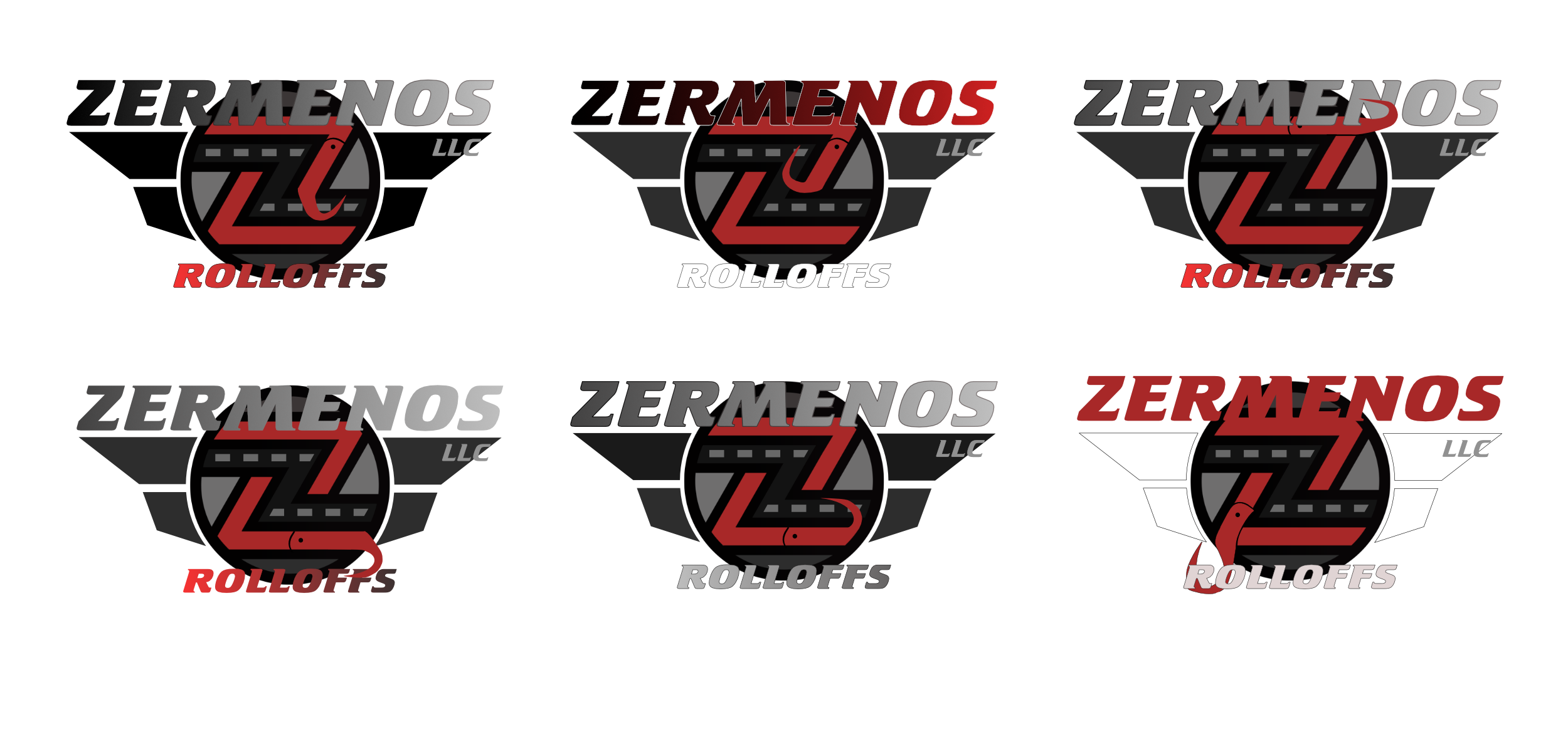
Len Zermeno’s Trucks
Is a tow industry only family run business. They love what we do and it shows. They believe in quality not quantity using only Kilar beds modified to specifications, providing strength with a great look. They do it once and They do it right with a team of the right people, knowledge, and equipment with service that is second to none. They pride themselves on excellent product at Mercedes quality and strength at a Kia price!


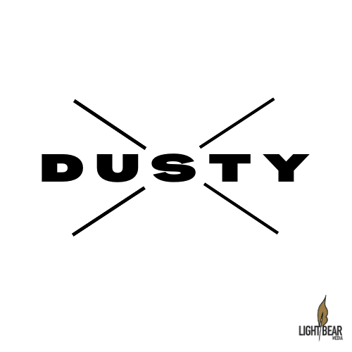
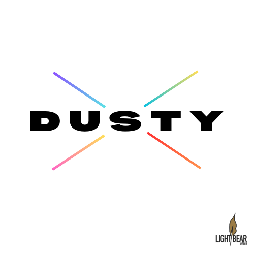
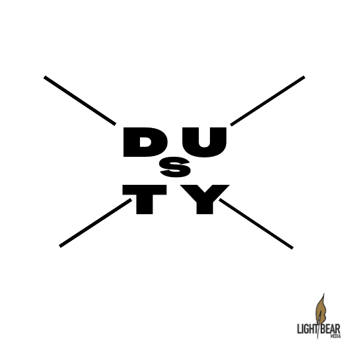
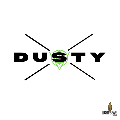
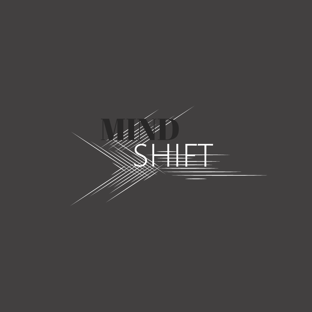
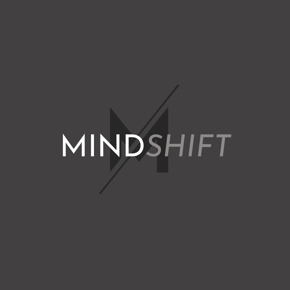
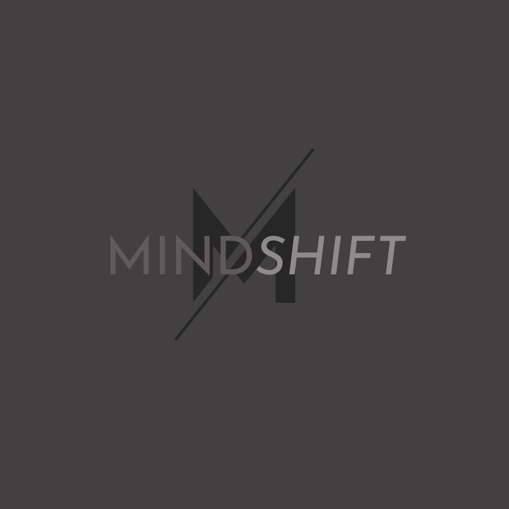
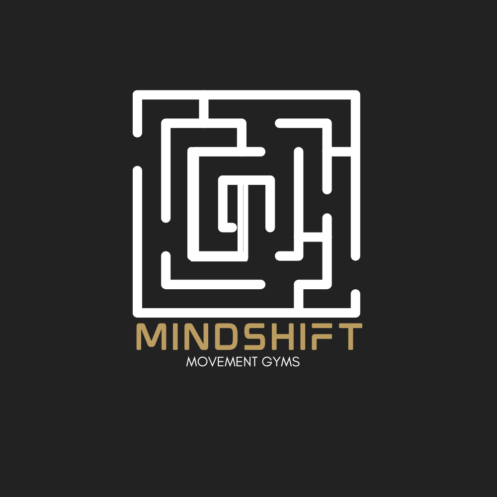
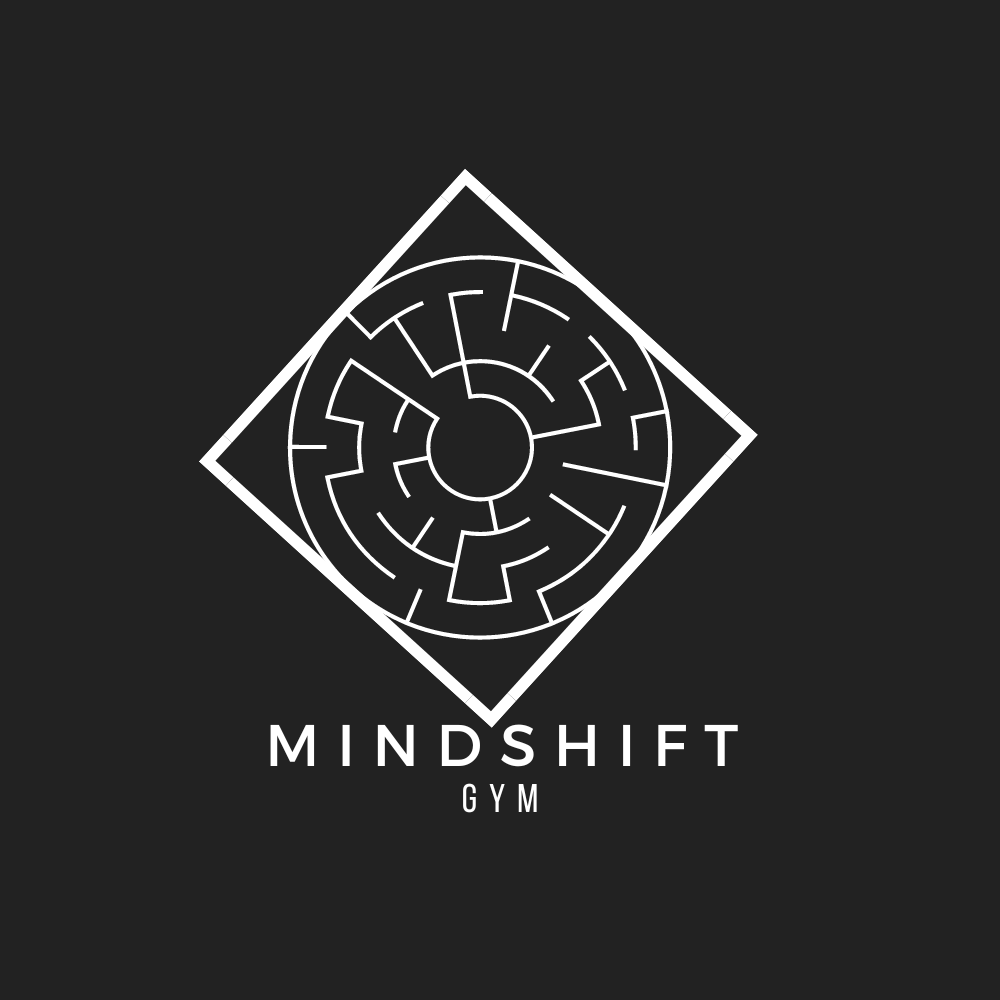
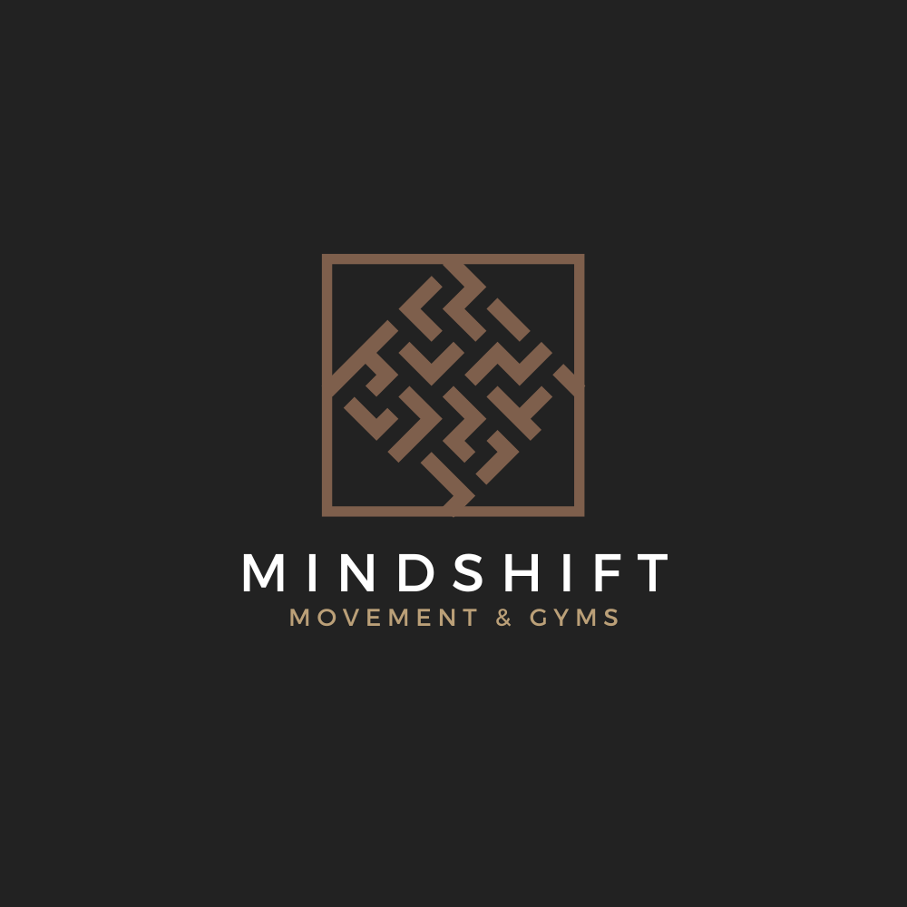
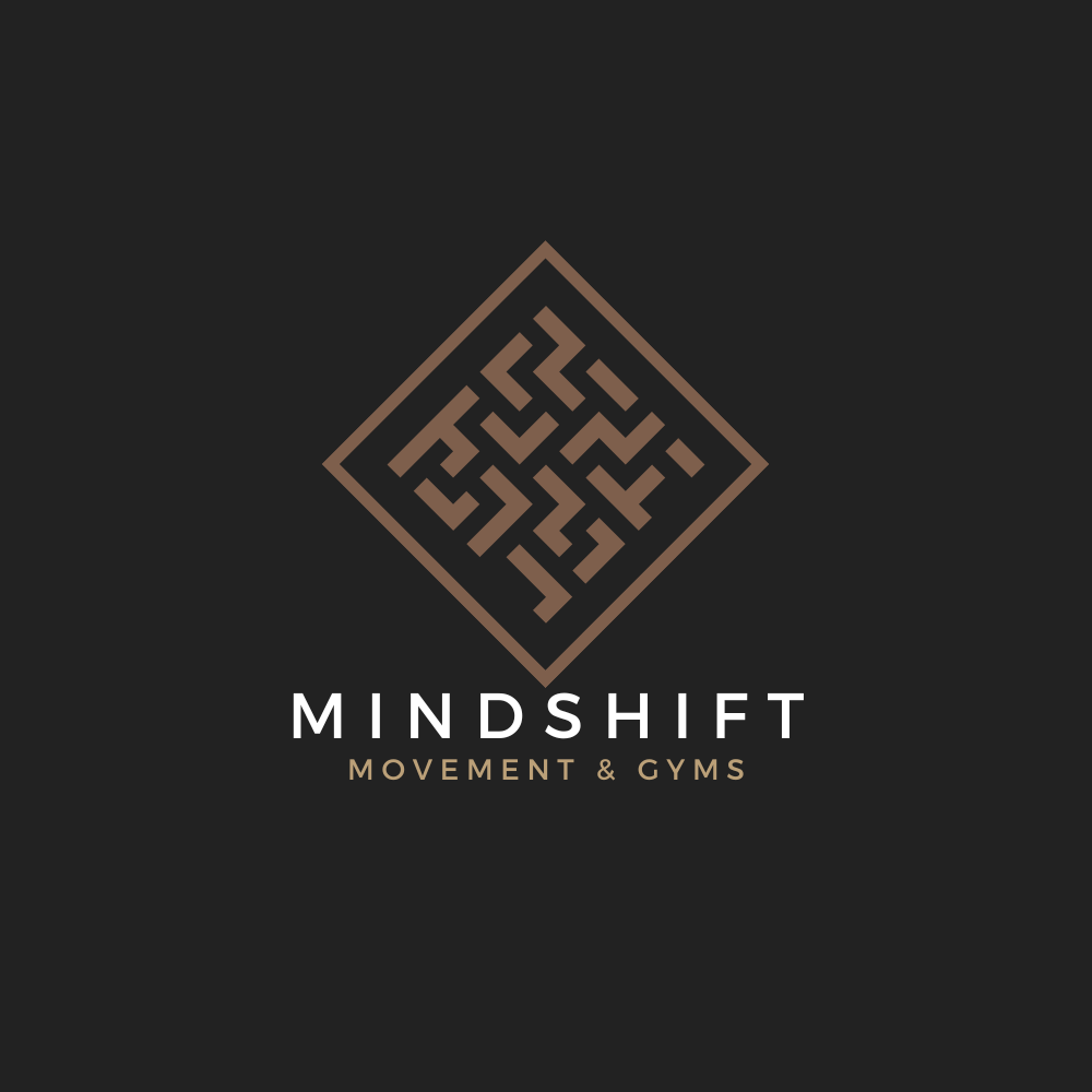
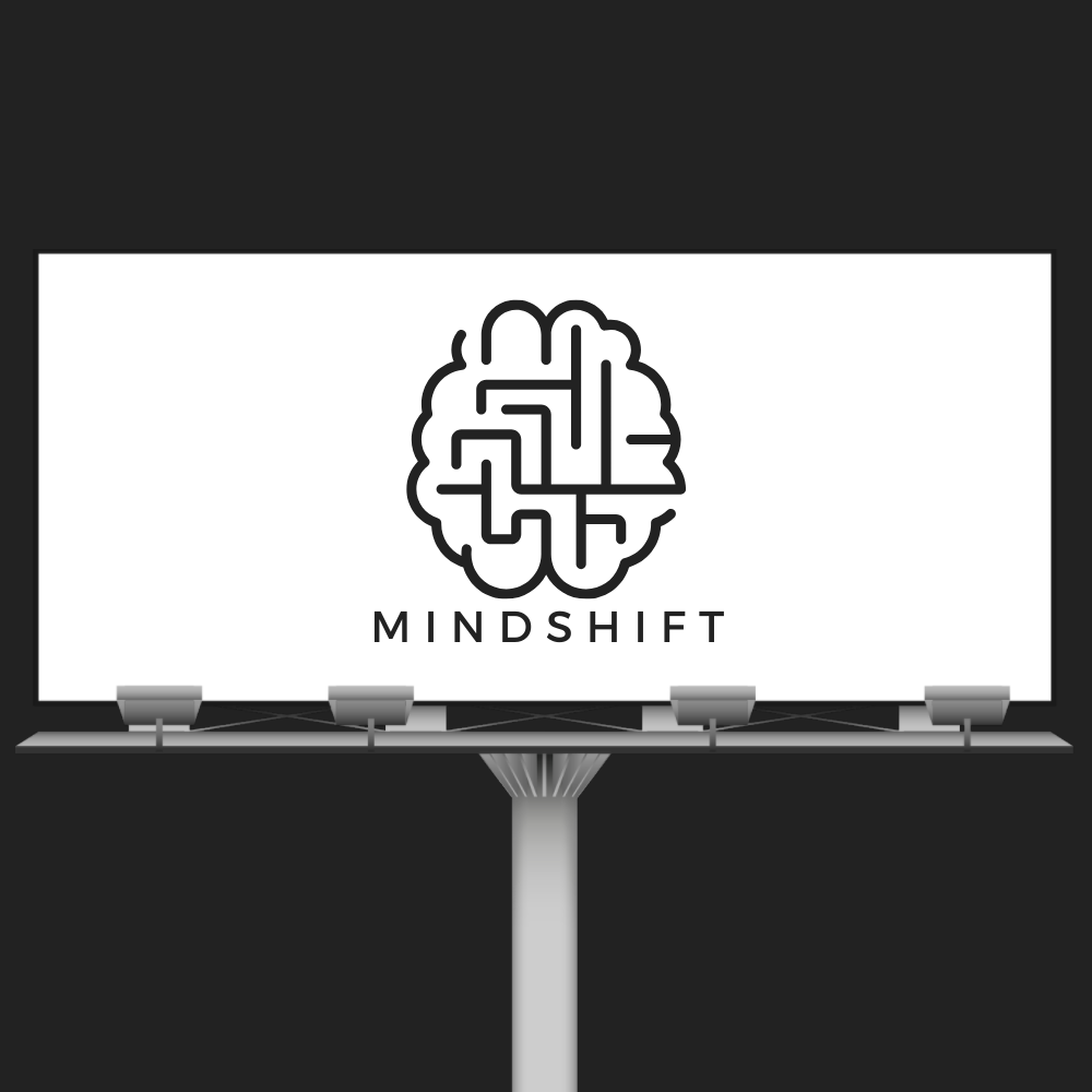
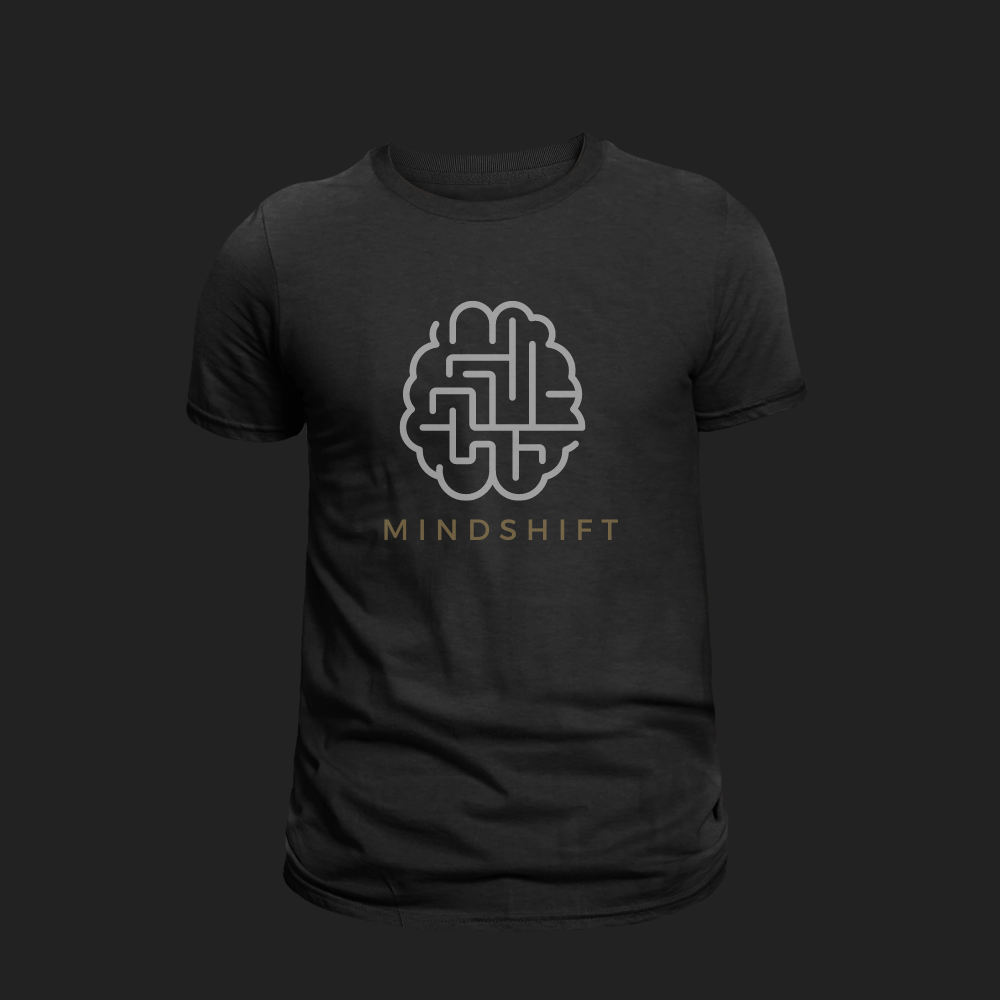
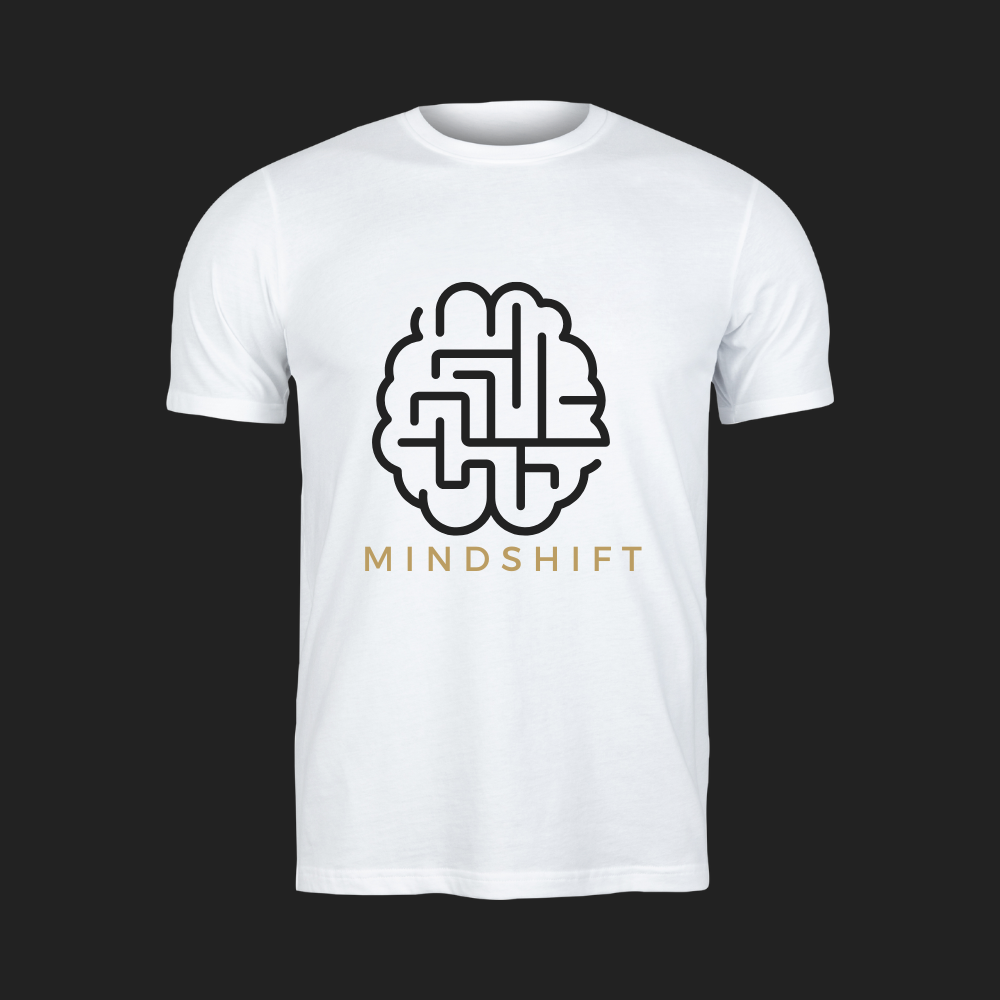
MINDSHIFT
A business specializing in the ownership and control of family-oriented movement focused gyms in Alexandria, Virginia specifically specializing in parkour and aerial silks sought our help with branding and logo design.
We wanted the logo to convey the essence of movement and encourage creative and cognitive thinking.
Below is our iterative design process in the formulation of the logo and branding.


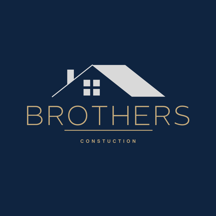
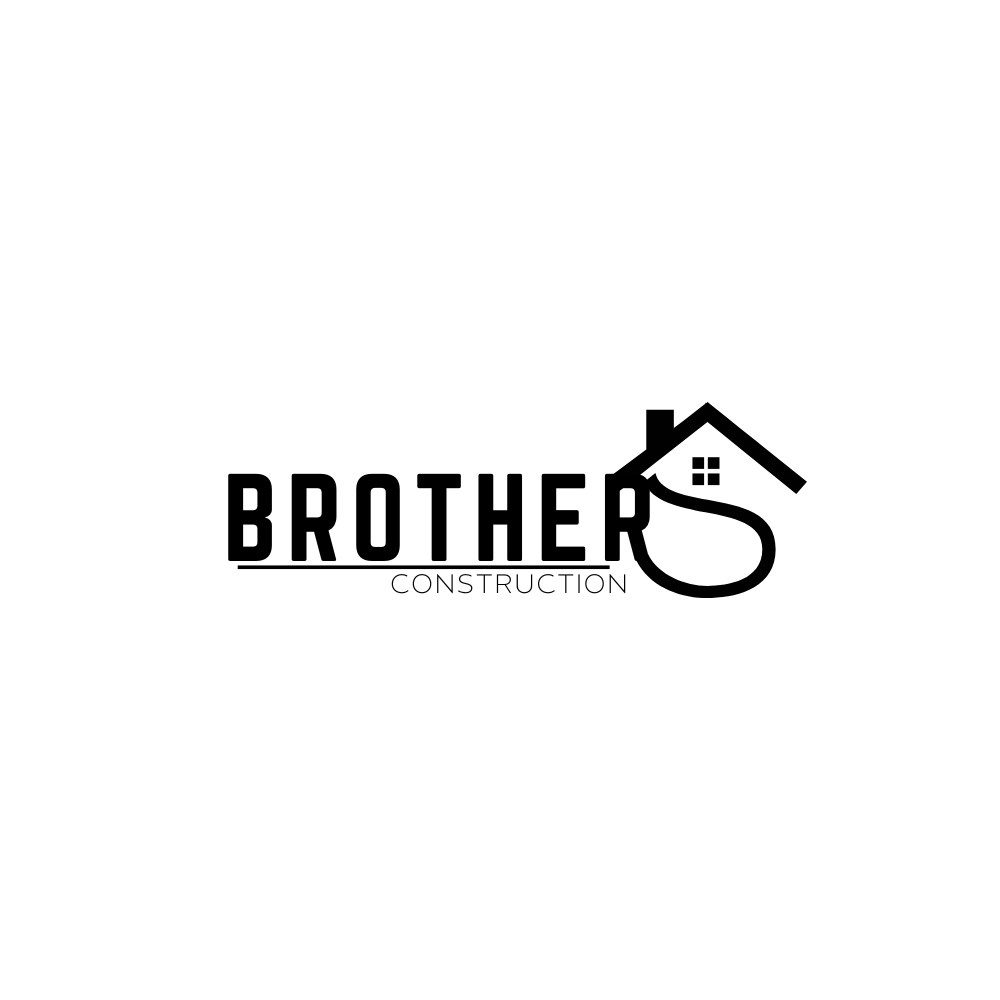
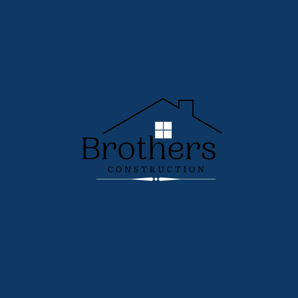
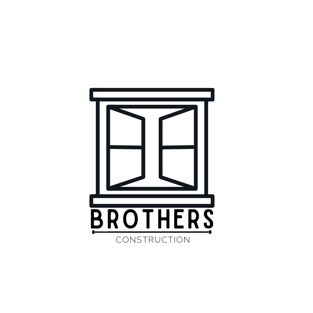
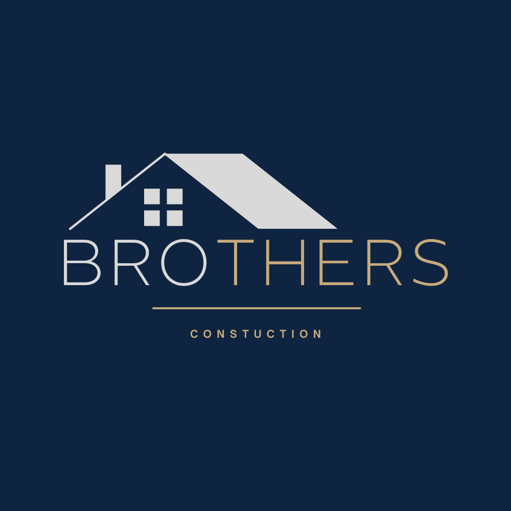
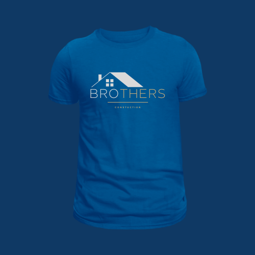
Brother's Construction
a reputable home construction and renovation company in Ohio with over 20 years of experience, looked to renovate their logo. We wanted their logos to match the level of modernization they bring to the homes they build and reconstruct. The design of a logo can vary greatly depending on the company's image, values, and target audience.
For Brother's Construction, a simple and modern logo design is a good choice. This can be achieved by using clean lines, geometric shapes, and a minimal color palette.


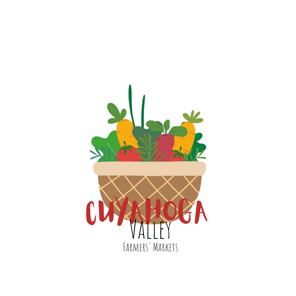
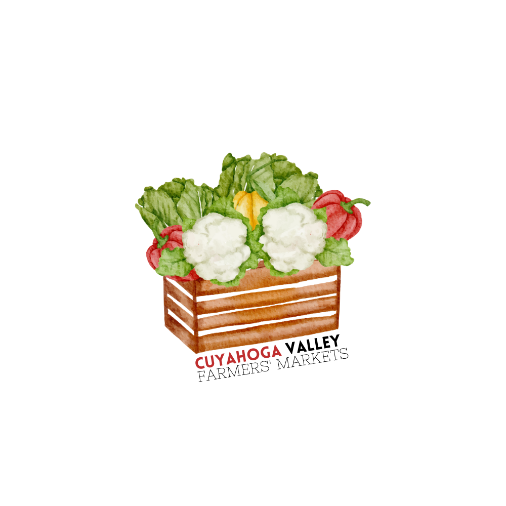
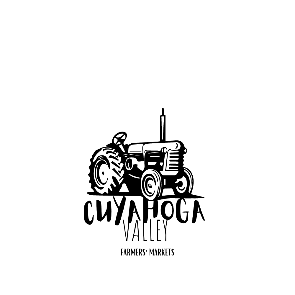
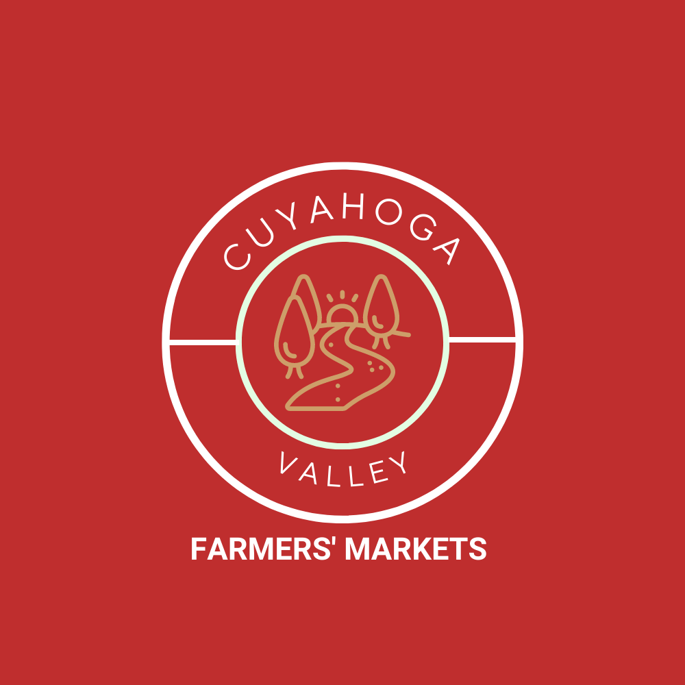
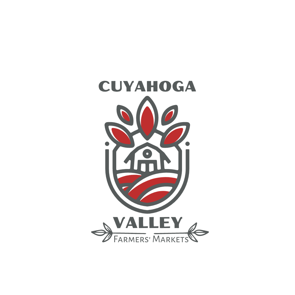
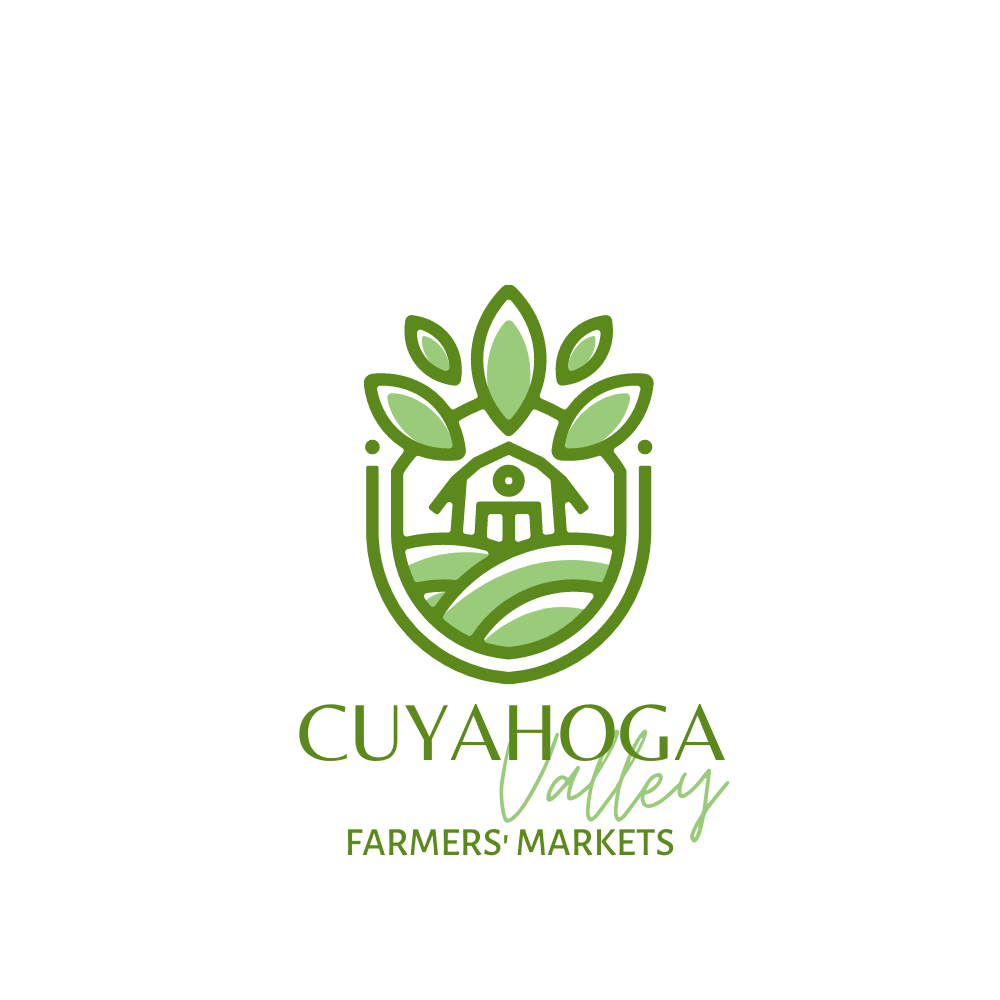
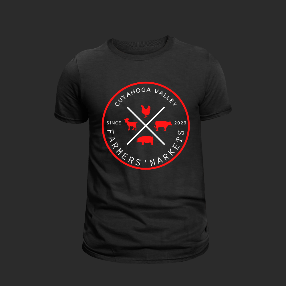
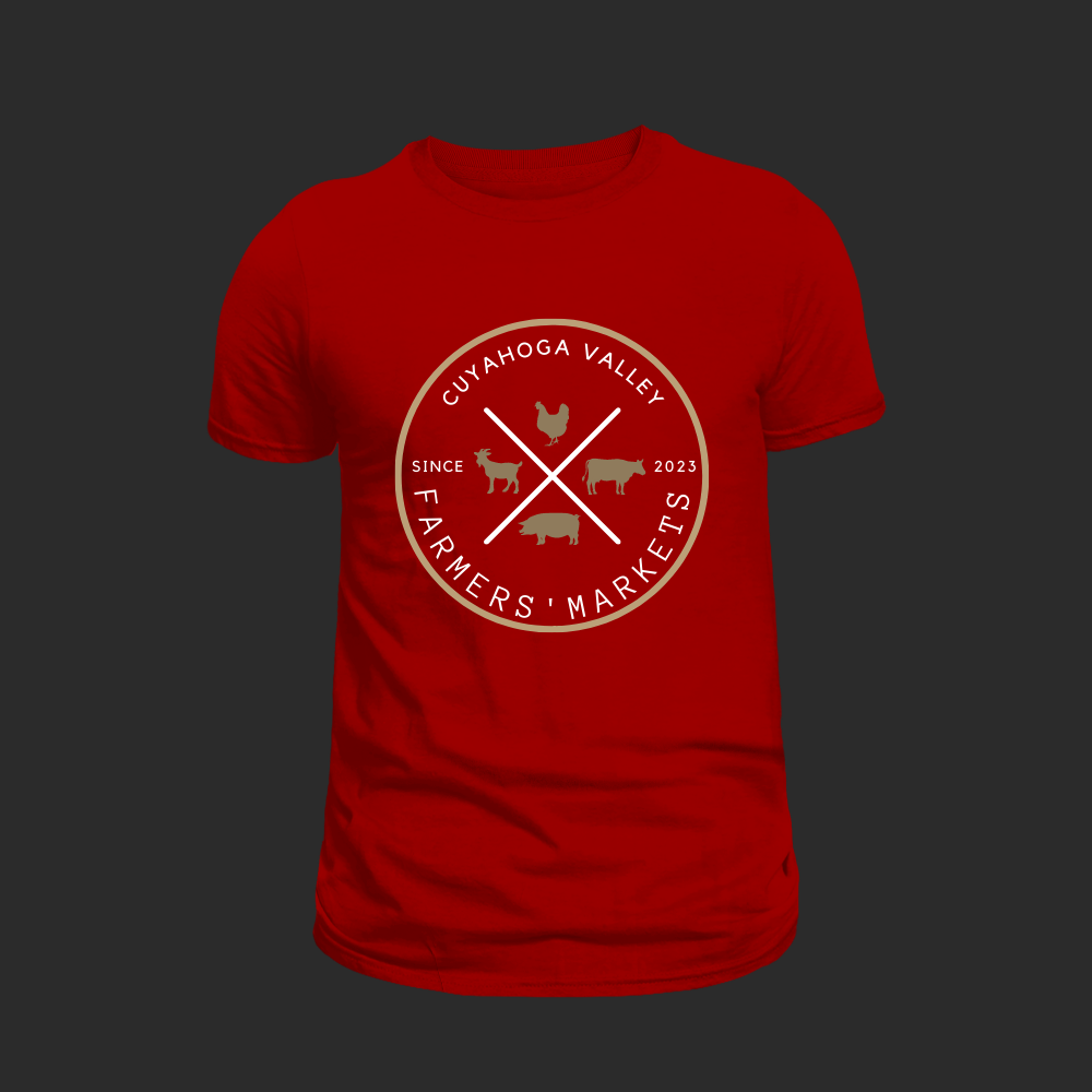
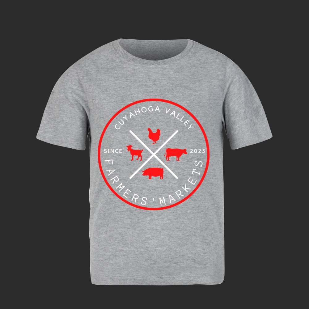
Cuyahoga Valley Farmers’ Market
was looking for a new logo design for their organization. Below, you will find the focus on locally grown and farmer-run products is reflected in the design. The logos capture the essence of the market and helps establish a strong brand identity.
Our goal was to have these logos successfully convey the values of the market and highlight its commitment to locally sourced and farmer-controlled products.


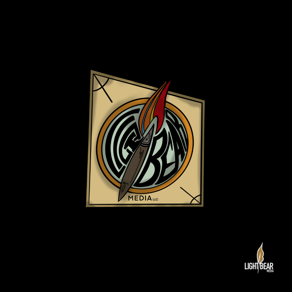
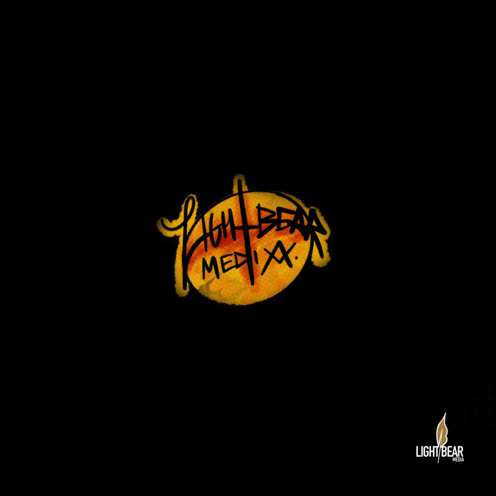
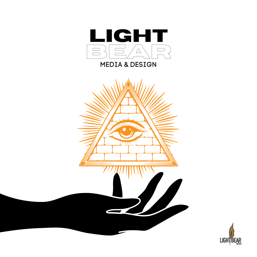
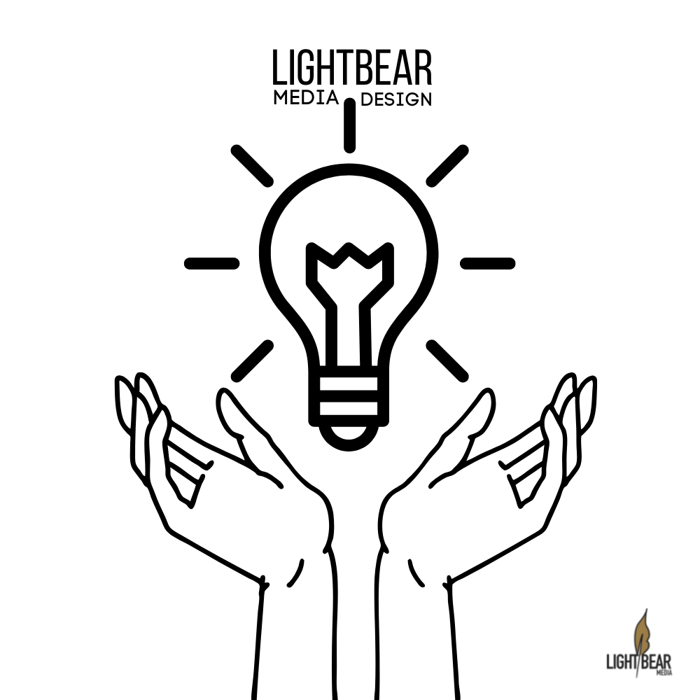
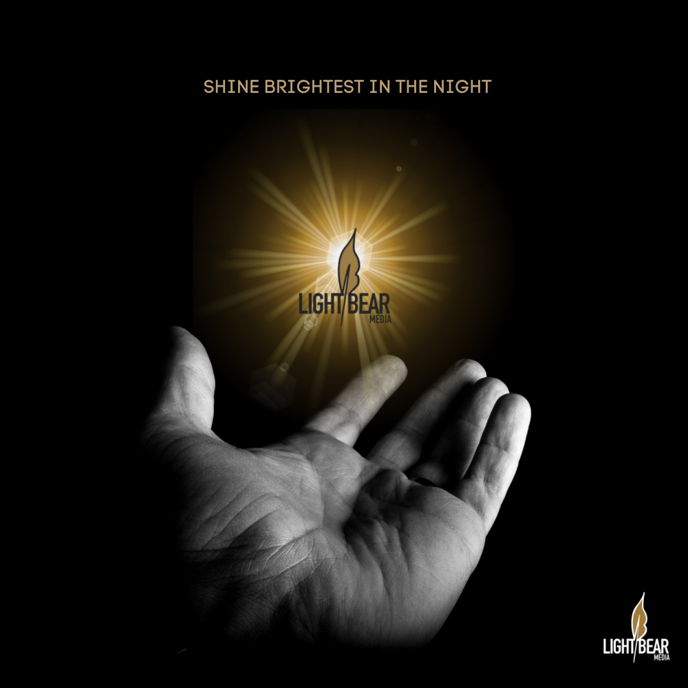
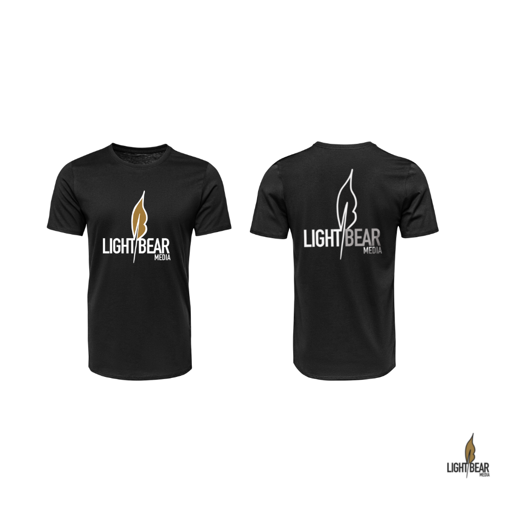
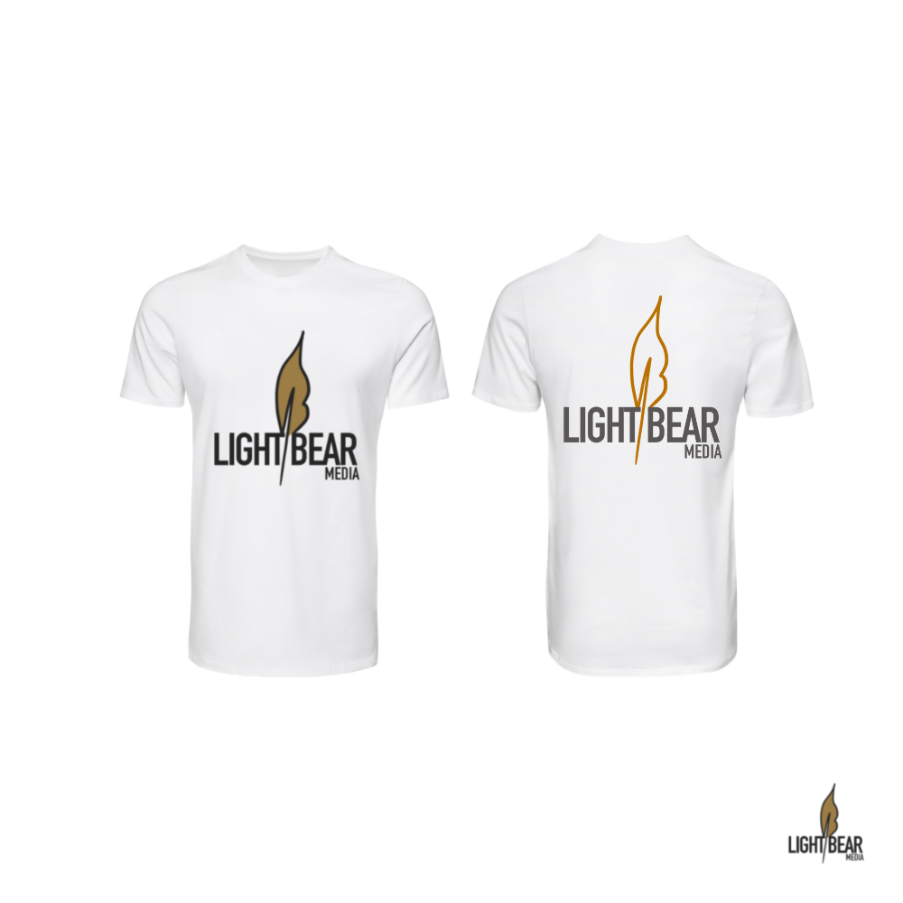
This is the work we did in the process leading up to the current logo/brand design for LIGHTBEARMEDIA